How to eat healthy: the full research behind the seven rules
Notes. A reading of the nutrition literature, not medical advice, and not written by a clinician or a nutrition scientist. Everything here is for healthy adults in the general population. If you have kidney disease, inflammatory bowel disease, or take medication that changes how your body handles potassium, the protein and fiber points need a clinician. Corrections welcome.
At 10,000 feet
Body weight moves life expectancy by years. Every rule here moves risk by percentage points. Track weight weekly, by scale or waist. The BMI lines sit lower for some ancestries (below). Calorie density leads as the strongest measured driver of overeating, not as a harm in itself.
- Setting. Ordinary food decisions. Which packaged meal, which bread, whether the additive list matters.
- Problem. The popular version points at additives, seed oils and processing labels. The measured effects sit somewhere else.
- What this note establishes. Seven rules, ranked by size of effect and then strength of evidence, with the evidence under each and the result that would overturn it. The top three levers:
- Calorie density and eating speed: +662 kcal a day from density in a ward trial, 369 fewer on slow-to-chew food.
- Fiber and protein: 15% lower death in the highest-fiber eaters (RR 0.85), 1.2 kg of lean mass kept on higher protein with training.
- Liquid calories: 450 kcal a day of soda not offset at all.
- Also established. The trials cannot rule out an extra effect from processing itself of up to about 250 kcal a day. The additive evidence is mixed rather than clean.
- Takeaway. Calorie density, fiber, protein and liquid sugar carry most of the measurable signal. Next, in order: the saturated-fat swap (trial events), alcohol (genetic data on deaths), salt (trial blood pressure) and processed meat (cohort data). Additives carry very little at real doses. Erythritol has a human signal at a reachable dose. Potassium bromate and titanium dioxide are precautionary flags. “Ultra-processed” is a rough proxy for the first list.
Why weight comes before the food rules
Three everyday habits each cost about 3 to 5 healthy years: excess weight, inactivity and smoking. Weight is the one that diet moves. The food rules below move risk by percentage points.
-
Stenholm 2016 (Int J Epidemiol, four European cohorts, ages 50 to 75): a BMI of 30 or more cost 4.1 to 4.2 years in good health and 4.5 to 4.6 years free of chronic disease. Inactivity cost 4.3 to 4.7 years in good health, smoking 3.0 to 3.5. Smoking costs far more total years.
- Prospective Studies Collaboration 2009 (Lancet, 894,576 adults, 57 studies): mortality was lowest at a BMI of about 22.5 to 25. Each 5 BMI units above that raised it about 30% (HR 1.29).
- The same analysis: at a BMI of 30 to 35, median survival is 2 to 4 years shorter. At 40 to 45 it is 8 to 10 years shorter, comparable with smoking.
- Global BMI Mortality Collaboration 2016 (Lancet, 10.6 million people, 239 studies) kept never-smokers in its main analysis. Per 5 BMI units above 25, the HR was 1.29 to 1.39 across four continents.
All three are observational. The survival figures come from the 2009 analysis. Quotes are on the nutrients research page.
The short version is the post: How to eat healthy, according to the evidence.
The statistics words used below, in plain English
- p-value: the chance of seeing a result this big if the treatment did nothing. Smaller means harder to write off as luck.
- 95% confidence interval: the range of true values the data are compatible with. If it crosses zero (or 1.00 for a ratio), no effect is still on the table.
- Relative risk and hazard ratio: two groups as a ratio. 1.00 means no difference, 1.13 means 13% higher, 0.65 means 35% lower. A hazard ratio tracks that gap over follow-up rather than once at the end.
- Standardized mean difference (SMD): puts results on different scales onto one ruler. 0 is no difference, 0.2 counts as small.
- Cohort: a long-term study that follows a group of people.
- Prospective: people enrolled before the outcome happens.
Objections to the ranking itself
- Skeptic: no common metric. The rules mix deaths, cardiovascular disease, diabetes and blood pressure at different doses. Narrowed: the order is by size of effect, then strength of evidence, and it is a judgment.
- Low-carb: carbohydrate drives fat gain. Ebbeling 2018 (n=162, PMID 30429127): energy expenditure rose 52 kcal/day per 10% less carbohydrate. DIETFITS (n=609, PMID 29466592): -5.3 kg low-fat against -6.0 kg low-carb at 12 months, not different. Hall 2021 (PMID 33479499): low-fat intake was 689 ± 73 kcal/day lower. Survives.
- Move more instead. Pontzer 2016 (n=332, doubly labelled water, PMID 26832439): at high activity, total energy expenditure plateaued. Survives: exercise does not scale calorie burn the way food scales intake.
What varies by person, with measured spreads only
- BMI by ancestry. Caleyachetty 2021 (England, PMID 33989535): the type 2 diabetes incidence of BMI 30.0 in White adults is reached at 23.9 in South Asian, 28.1 in Black and 26.9 in Chinese adults.
- Genes and weight loss. Livingstone 2016 (8 trials, 9,563 people, PMID 27650503): FTO risk-allele carriers “respond equally well to dietary, physical activity, or drug based weight loss interventions”. DIETFITS: genotype pattern did not predict low-fat vs low-carb success.
- Post-meal glucose. PREDICT (PMID 32528151): between-person variation of 68% for glucose and 103% for triglyceride after identical meals. The Personal Diet Study (PMID 36169954): a diet tailored to glucose response “did not result in greater weight loss compared with a low-fat diet”.
- ApoE and saturated fat. SATgene (n=389, PMID 30336580): E4 carriers had greater falls in total cholesterol (p=0.02) and apoB (p=0.006) when saturated fat was replaced, though with low-GI carbohydrate, not oil. Self-test: a lipid panel 6 to 8 weeks after the swap.
- ALDH2 and alcohol. Im 2022 (China Kadoorie Biobank, PMID 35048370): A-allele frequency 0.21. Among male drinkers, alcohol’s cancer risk was greater in AG than GG carriers for head and neck, oesophageal and lung cancer. Facial flushing after one drink marks the variant.
- Protein. Morton 2018: gains in lean mass plateau near 1.62 g/kg/day, are larger in the resistance-trained (+0.75 kg) and shrink with age (-0.01 kg a year). PROT-AGE (PMID 23867520) still advises at least 1.0 to 1.2 g/kg/day over 65, 1.2 or more if active, because older muscle responds less.
- Lactose. Shaukat 2010 (PMID 20404262): “12 to 15 g of lactose (approximately 1 cup of milk) is well tolerated by most adults” with malabsorption. The widely quoted 68% global malabsorption estimate was retracted in 2025 (PMID 39674208) and is not used here.
- Fructose. Rao 2007 (20 healthy adults, PMID 17625977): 10% malabsorbed 25 g of fructose, 80% malabsorbed 50 g, 55% with symptoms.
- Salt. Gupta 2023: median within-person change in mean arterial pressure 4 mmHg (IQR 0 to 8), 46% at 5 mmHg or more.
The food words used below, in plain English
- Processed meat: meat preserved by salting, curing, smoking or fermenting (IARC). Bacon, ham, hot dogs, sausage, deli meat, salami, pepperoni. Deli turkey and chicken sausage count. “Uncured” still counts. Fresh chicken, beef and fish do not. Smoked or cured fish is outside this evidence. Cantonese-style salted fish is a separate IARC Group 1 carcinogen.
- Calorie-dense: over 4 kcal per gram is high (chips, crackers, cookies). Under 1.5 is low (vegetables, fruit, beans). Chicken breast is 1.65, medium (USDA). Bands from Rolls 2017.
- Added vs total sugar: added sugar is put in. Total sugar also counts the sugar in whole fruit, which does no measured harm.
- Refined starch: white flour and white rice, and foods made from them such as white bread and most crackers.
- Liquid calories: anything drunk that has calories: soda, juice, smoothies, alcohol.
- One drink: 14 g of alcohol in the US (NIAAA): 12 oz of beer, 5 oz of wine or 1.5 oz of spirits. The GBD alcohol curve uses 10 g, so one US drink is 1.4 GBD drinks.
- CVD: cardiovascular disease, heart and blood-vessel disease.
- Ultra-processed: a label from the NOVA system. Trained raters sort foods into it with only “fair” agreement, so it is a rough proxy.
Raw research and data: the working documents this page summarizes
The underlying research files, long, rough and unedited. Each carries its own reference list with study names, sample sizes and source links.
- The rubric: headline findings, tier tables, dose multiples and the weighting.
- Nutrients: protein, fiber, sodium, potassium, sugar and fat, with dose-response curves.
- Foods: meat, fish, grains, vegetables, oils, dairy and contaminants.
- Patterns: ultra-processed epidemiology and its scoring systems.
- Composition: what still differs between two meals whose nutrition panels match.
- Curiosity index: trust level and scope of the four reports below.
- Mechanisms beyond density: the ward trials, texture, eating rate and calorie availability.
- Theories and anomalies: results that do not fit, including the bread problem and the negative-control test.
- Counterintuitive levers: food order, vinegar, water preloads, almond calories, eating speed.
- Frontier 2024 to 2026: the newest trials, including those that cut against the story.
- Organic: residue biomarkers, the composition meta-analyses, the organic-consumer cohorts and the health halo.
- Charts and data: every chart as a PNG, the script that draws them, and a README with the docker command that regenerates them, all under
/assets/img/eat-healthy/.
Rule 1: calorie density is the largest measured lever
 Source: USDA, per 100 g.
Density explains most of the overeating that ward trials can measure.
- People eat a fairly steady weight of food per day, not a steady number of calories. Denser food therefore delivers more calories before fullness arrives.
- Potato chips: 530 kcal per 100 g. Chicken with vegetables: 100 to 130 kcal.
- Label test, from the Rolls bands: over about 400 kcal per 100 g is high, under 150 is low. No eating-speed target has been tested.
- Nuts and olive oil are exempt: 594 and 884 kcal per 100 g (USDA FDC 168599, 171413), yet PREDIMED (7,447 people, PMID 29897866) gave them away free and cut major cardiovascular events, HR 0.69 (0.53 to 0.91) with olive oil and 0.72 (0.54 to 0.95) with nuts. Weight over five years: “no significant difference in bodyweight” (PMID 31003626). About 32% of almond energy on the label is not absorbed (Novotny 2012). Caveats: the 2013 paper was retracted for randomisation failures, the 2018 estimates rest on propensity adjustment, and funders included nut and olive-oil industry bodies.
- In the 2026 NIH ward trial people overate by about 950 kcal/day. Density alone drove +662.
- Trial evidence, the best tier here.
What the 2026 ward trial measured
Overeating split three ways, and only the density arm was large.
- The 2026 NIH ward trial (NCT05290064) enrolled 38 people, 36 completing four one-week inpatient diets. It was a randomized crossover (each person ate all diets, in random order), every gram weighed.
- Total overeating was about 950 kcal/day. The chart in the ultra-processed section below splits it three ways, each arm with its p-value.
Why the 2019 trial's density match did not hold
It matched on paper and not on the plate.
- The 2019 ward trial (Hall 2019, Cell Metabolism) was supposed to match its arms on energy density. It matched only once beverages were counted.
- On what people actually ate, non-beverage density was 1.96 kcal/g ultra-processed against 1.08 unprocessed.
- Non-beverage food mass was 726 g/day higher on the unprocessed arm, in every one of the 20 participants.
Why the trial tier is discounted here
Two limits, one about publication and one about design.
- The 2026 results are registry postings, not yet peer-reviewed.
- The design is a ladder, not a factorial (each arm changes one thing at a time), so combined effects cannot be measured.
- Overturned by a ward trial that lowers density by adding water to identical foods instead of swapping foods, and comes back null.
Objections to rule 1, with the best study for each
- Skeptic: short trials, small weight effects. Dicken 2025 moved weight 1% in 8 weeks. Forde 2026 found no weight change in healthy-weight young adults. Robinson 2026 (PMID 42746678): “evidential certainty is low”. Narrowed: the kcal figures are short-term intake.
- NOVA authors: the bundle is the harm. Lancet 2025 (PMID 41270766): overeating is “driven by high energy density, hyper-palatability, soft texture, and disrupted food matrices”. Rezende 2026 (PMID 42806345) adds additives and contaminants to the bundle. The processing-only contrast is +128 kcal/day (-8 to 265, p=0.065), up to about 250 kcal/day. Emulsifiers: NutriNet-Santé (PMID 37673430), celluloses HR 1.05 per SD for CVD. Survives, narrowed: density is the larger proven part. Avoiding ultra-processed food is a fair shortcut to the same shelf.
- Low-carb camp: diabetes remission. Goldenberg 2021 (23 trials, PMID 33441384): six-month remission 57% against 31% (HbA1c under 6.5%), smaller without medication, sparse at 12 months. Te Morenga 2013 (PMID 23321486): swapping sugar for other carbohydrate at equal energy changed weight 0.04 kg (-0.04 to 0.13). Hall 2016 (PMID 27385608): isocaloric keto “was not accompanied by increased body fat loss”. Narrowed: for weight, density. For diabetes, cutting refined carbohydrate is a glucose tool.
- Industry: reformulate, the label is the wrong target. Forde 2026 was funded by a public-private partnership, and its first author reports food-industry advisory ties. Survives: the label is treated as a proxy here.
Rule 2: fiber has the best long-term evidence and the weakest trial evidence
 Source: Reynolds 2019, all-cause mortality, 10 long-term studies, RR 0.85 (0.79 to 0.91).
High-fiber eaters die 15% less often (RR 0.85, 0.79 to 0.91). The trials cannot show that fiber itself is the reason.
- The 15% comes from Reynolds 2019, a pooled analysis of 185 prospective studies and 58 trials. The abstract’s “15-30%” spans seven outcomes. The 0.69 end is coronary death, flagged for publication bias.
- US adults average about 16 g a day (national survey data, Quagliani 2017) against the Institute of Medicine’s Adequate Intake of 25 g for women and 38 g for men.
- The dose-response keeps falling across the studied range. The commonly quoted 25 to 29 g/day is a floor, not an optimum.
- The mortality claim is entirely observational.
What the 58 trials measured, and where fiber came back null
Risk factors only, and the effects are small.
- GRADE, the standard scale for confidence in a body of evidence, rates the mortality result moderate certainty.
- The 58 trials (n=4,635) reported body weight, blood pressure and total cholesterol, no disease outcomes. Body weight: -0.37 kg (GRADE high). Systolic blood pressure: -1.27 mmHg. Total cholesterol: down about 5.8 mg/dL.
- A Cochrane review of fiber for colorectal adenoma recurrence found RR 1.04 (0.95 to 1.13), null.
- The falling dose-response covers cardiovascular disease, type 2 diabetes, colorectal cancer and breast cancer.
Why fiber is most likely a marker rather than the cause
Inferred, not measured. Risk-factor changes that small are far too small to account for a 15% mortality reduction. Fiber is most likely a marker for a whole-plant-food diet.
A modest causal core does exist, in three places.
- Viscous fiber lowers LDL, the cholesterol carrier that tracks heart risk.
- Bulk and laxation, meaning stool keeps moving.
- High-fiber food displaces calorie-dense food.
Overturned by a long trial that raises fiber and counts deaths. A null result would barely move the advice, because high-fiber foods are the same low-density foods.
Rule 2, continued: protein protects muscle with training and trims appetite
Protein decides how much lean mass you keep or add while losing fat, when you lift. Raising it also cuts how much people eat.
- Weigle 2005 (n=19, PMID 16002798): raising protein from 15% to 30% of energy cut ad libitum intake 441 ± 63 kcal/day.
- Doing it well: with lifting, gains level off somewhere between 1.0 and 2.2 g/kg/day. The best estimate is 1.6, and that estimate was not statistically significant (Morton 2018, breakpoint CI 1.03 to 2.20, p=0.079). Over 65, trials found gains at 1.2 to 1.6; the PROT-AGE floor is 1.0 to 1.2 g/kg/day, 1.2 or more if active.
- In Longland 2016 (with resistance and interval training six days a week), the 2.4 g/kg/day group gained 1.2 ± 1.0 kg of lean mass. The 1.2 g/kg/day group gained 0.1 ± 1.0 kg.
- Across 49 trials the lean-mass benefit plateaus near 1.6 g/kg/day (CI 1.03 to 2.20, the plateau fit itself not significant), and the pooled gain is about 0.3 kg.
- Serving weight predicts fullness better than any nutrient (r=0.66). Protein is the weakest nutrient that still predicts it (r=0.37).
How the 2016 muscle trial was run
An extreme deficit with heavy training, which is why the split is so wide.
- Longland 2016 was a randomized trial in 40 overweight young men over four weeks. It was single-blind and parallel: neither diet was hidden from staff, and the two arms were separate groups. Both ran a roughly 40% energy deficit with six days a week of resistance training plus intervals.
- The high-protein group, 2.4 g/kg/day, gained 1.2 ± 1.0 kg of lean mass and lost more fat (-4.8 kg).
- The lower-protein group, 1.2 g/kg/day, gained only 0.1 ± 1.0 kg of lean mass and lost less fat (-3.5 kg).
- Across 49 trials (n about 1,863) the lean-mass benefit plateaus near 1.6 g/kg/day, with a wide interval (1.03 to 2.20). Morton’s pooled lean-mass gain is about 0.3 kg, real but small.
- The muscle result is a trial but an extreme one.
What the satiety index ranked
Three ways of measuring calorie density, then protein a long way behind.
- The classic satiety-index study used 38 foods at 240 kcal each, with 11 to 13 subjects per food.
- The strongest correlate of fullness was serving weight (r=0.66), then water content (r=0.64), palatability negative (r=-0.64). All three are calorie density measured another way.
- Protein was the weakest nutrient that still predicted fullness (r=0.37).
- The satiety index has 11 to 13 people per food, one two-hour window, and has never been replicated at scale.
- The satiety index ranks single foods at fixed calories. Weigle 2005 changed whole diets and found protein cuts intake. The trial is the stronger test.
Objections to rule 2, with the best study for each
- Skeptic: people who eat more fiber are just healthier overall. In the 58 trials, adding fiber lowered weight by only 0.37 kg and blood pressure by only about 1 point. A trial of bran supplements did not stop precancerous colon growths (polyps) from coming back. Narrowed: high-fiber eaters have about 15% lower risk of death, but part of that is likely because they are healthier in other ways.
- Low-fiber camp: fiber hurts some guts. Peery 2012 (colonoscopy, n=2,104, PMID 22062360): top fiber quarter, diverticulosis prevalence ratio 1.30. Ho 2012 (n=63, PMID 22969234): stopping fiber eased idiopathic constipation. Cross-sectional and unblinded. Survives for the general population.
- Fortified-food makers: added fiber counts. Isolated-fiber trials show small or null effects. Narrowed: from whole foods.
- Skeptic on protein: the lean-mass gain needs training. Longland trained six days a week. Morton 2018 (49 trials, n=1,863, PMID 28698222): FFM +0.30 kg, plateau at 1.62 g/kg/day, larger in the resistance-trained, smaller with age. Narrowed: protects muscle when you lift while losing weight.
- Protein restriction: high protein shortens life. Levine 2014 (NHANES, PMID 24606898): “Respondents aged 50-65 reporting high protein intake had a 75% increase in overall mortality”. One recall, reversed over 65. Survives in the weight-loss scope.
- Protein camp: protein is the most satiating nutrient. Weigle 2005 (n=19, PMID 16002798): 15% to 30% protein cut ad libitum intake 441 ± 63 kcal/day. The earlier claim that protein is a weak appetite tool falls.
Rule 3: liquid calories are compensated for poorly
 Source: DiMeglio and Mattes 2000, n=15, 450 kcal a day for four weeks each.
Calories eaten as solids get eaten back in full at later meals. Drunk calories do not, so they land on top of everything else.
- The same 450 kcal/day was compensated +118% as jelly beans and -17% as soda.
- Body weight and BMI rose only during the liquid period.
- At matched weight gain, fructose loaded visceral fat. Glucose loaded the fat under the skin (Stanhope 2009).
How the 15-person crossover was run
Same sugar, same calories, two forms, four weeks each.
- DiMeglio and Mattes 2000 (PMID 10878689) is a crossover in n=15 adults. About 450 kcal/day of carbohydrate came as soda in one four-week period. The same amount came as jelly beans in another. Between the two sat a four-week washout, a gap between the two diets.
- Compensation was -17% for the liquid and +118% for the solid. Body weight and BMI rose only during the liquid period.
- This is the cleanest mechanism result here, and also just 15 people over four weeks. Overturned by a larger crossover that fails to reproduce the compensation gap.
What the fructose trial adds, and where it overreaches
A real fat-distribution result, then a subgroup finding that is too thin to carry weight.
- Stanhope 2009 fed 25% of energy as fructose for 10 weeks. It ran n=32 in total, with the fructose arm at n=17, adults aged 40 to 72, overweight or obese.
- At matched weight gain, fructose loaded visceral fat, the fat around the organs. Glucose loaded the fat under the skin.
- The sex split (men +18.1%, women -0.6%, p=0.049) is across all 32 people on both sugars. The fructose-only sex comparison is p=0.033. Both are post-hoc subgroups, post-hoc meaning chosen after seeing the data.
- The study fed a quarter of all calories as pure fructose, far more than any drink delivers.
- The cohort half is softer. Its sugary-drink estimate (about RR 1.26 for diabetes, highest drinkers against lowest) comes from the same cohort literature whose confounding floor the accidental-death test measures.
Objections to rule 3, with the best study for each
- Skeptic: one 15-person trial. Almiron-Roig 2013 (253 preloads, PMID 23815144): “Energy compensation ranged from -370% (overconsumption, mostly of liquids) to 450%”. Narrowed: compensated less, not ignored. Strongest trial: de Ruyter 2012 (641 children, 18 months, PMID 22998340), 6.35 kg gained sugar-free against 7.37 kg sugary.
- Industry: diet drinks beat water. Peters 2016 (n=303, beverage-industry funded, PMID 26708700): 6.21 kg lost on sweetened drinks against 2.45 kg on water at one year. Survives: the rule targets calories.
- Industry: cutting soda does little. Kaiser 2013 (PMID 23742715): an effect of about 0.25 standard deviations, only in people overweight at baseline. Bes-Rastrollo 2013 (PMID 24391479): conflicted reviews were “five times more likely to present a conclusion of no positive association”. Survives.
Rule 4: replacing saturated fat with vegetable oil cuts heart events, not deaths
Ranking: fourth. Trial evidence on events: about 30% in four core trials, 17% across all trials. Deaths did not fall.
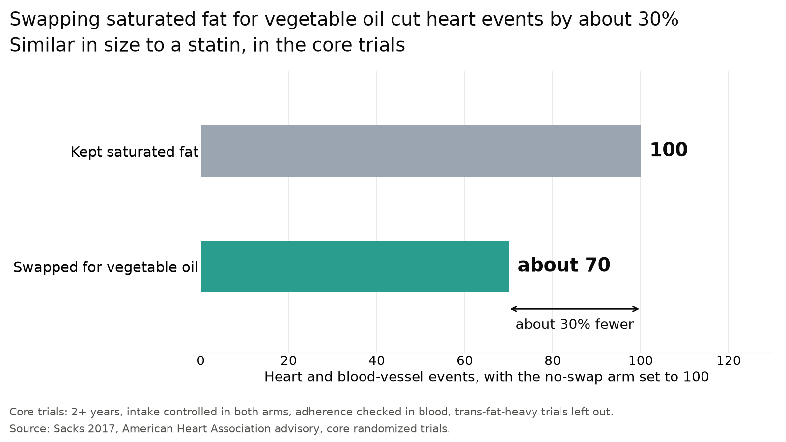 Source: Sacks 2017, American Heart Association advisory, core randomized trials.
What replaces the saturated fat decides the result.
- Sacks 2017, an American Heart Association advisory, pooled the core trials. Swapping saturated fat for polyunsaturated vegetable oil cut cardiovascular events about 30%, similar to a statin.
- Doing it well: each 5% of energy moved from saturated to polyunsaturated fat gave about 10% lower coronary risk (Mozaffarian 2010). Check a lipid panel 6 to 8 weeks after.
- Across all trials (Hooper 2020 Cochrane, PMID 32827219): events RR 0.83, all-cause death RR 0.96, unchanged.
- Swapping saturated fat for refined starch or sugar shows no benefit in the cohorts.
The trial numbers, and the two trials that disagree
The swap trials agree once trans-fat margarine is filtered out.
- Sacks 2017 counted a trial as core if it ran two years or more and controlled intake in both arms. Blood markers had to confirm adherence. Trials heavy in trans fat were left out.
- Mozaffarian 2010 pooled 8 trials, 13,614 people, 1,042 coronary events. Polyunsaturated fat in place of saturated fat gave RR 0.81 (0.70 to 0.95). Each 5% of energy swapped gave about 10% lower risk.
- The Cochrane 2020 polyunsaturated-replacement subgroup is 7 trials (n=3,895, RR 0.73).
- The counter-evidence is two trials, from the 1960s and 1970s. Sydney Diet Heart reported higher mortality on the polyunsaturated arm, but its margarine carried unmeasured trans fat and the reanalysis is contested. Minnesota Coronary had short exposure and heavy dropout.
Overturned by a long, well-controlled trial without trans fat in which the vegetable-oil arm has more heart events.
Objections to rule 4, with the best study for each
- Skeptic: the 30% is four hand-picked trials. Hooper 2020 Cochrane (PMID 32827219): events RR 0.83, but “little or no effect of reducing saturated fat on all-cause mortality (RR 0.96”. Narrowed: fewer events, unchanged deaths.
- Anti-seed-oil: recovered trials show harm. Sydney Diet Heart (PMID 23386268): all-cause 17.6% against 11.8%, HR 1.62 (1.00 to 2.64). Minnesota Coronary (PMID 27071971): lower cholesterol, no lower death. Hamley 2017 (PMID 28526025): benefits came from inadequately controlled trials. Survives on events, falls on deaths.
- Dairy and meat: the food matrix matters. Astrup 2020 (PMID 32562735): whole-fat dairy and unprocessed meat “are not associated with increased risk of CVD”. PURE dairy (PMID 30217460): over 2 servings a day, mortality HR 0.83, butter null. Narrowed: the swap here is butter and lard to oil. Cheese and yogurt are a separate, open question.
Rule 5: alcohol has no proven protective dose, and risk climbs from two drinks
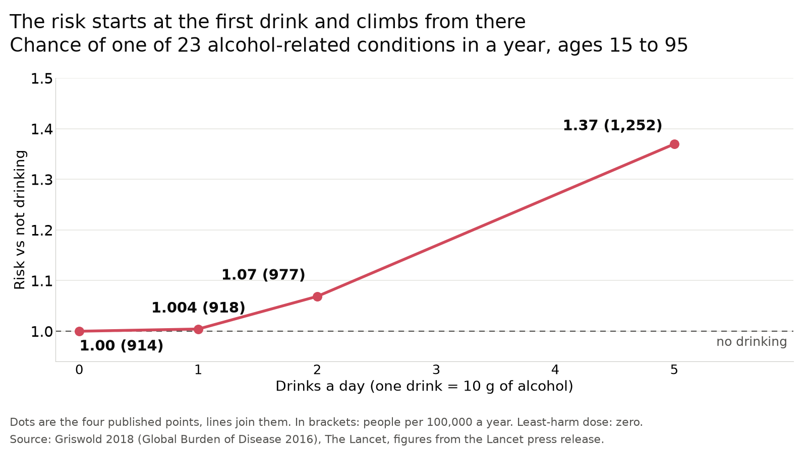 Source: Griswold 2018, Global Burden of Disease 2016, Lancet press release figures.
Ranking: fifth. Genetic evidence links higher intake to more deaths, which salt lacks. Small at one drink, rising from two.
- GBD 2016 (Griswold 2018, Lancet) put the least-harm dose at zero drinks (95% UI 0.0 to 0.8 a week).
- GBD 2020 (Bryazka 2022, PMID 35843246) kept zero to 0.6 for ages 15 to 39. At 40 and over the curve was J-shaped, minimum 0.114 to 1.87 standard drinks a day by region.
- Millwood 2023 (China Kadoorie Biobank, PMID 38000378): genotype-predicted intake was “uniformly and positively associated with risks of death from all causes”: HR 1.07 (1.05 to 1.10), 12,939 deaths. Stroke 1.18. The abstract does not state the dose unit for the genetic HRs. The observational HR was 1.18 per 100 g/week.
- Doing it well: zero is the least-harm dose under 40. Up to one 10 g drink a day showed little measurable risk. No guideline cap was fetched for this page.
- Zhao 2023 (107 cohorts, PMID 37000449): low or moderate daily intake was not tied to all-cause death. Risk rose at higher intake, sooner in women.
- Against no drinking, one 10 g drink a day is 1.004, two 1.07, five 1.37 for one of 23 alcohol-related conditions.
- Alcohol is an IARC Group 1 carcinogen, causally linked to seven cancers. The WHO authors in 2023 found no threshold for its cancer effect.
The quoted sources, and what the genetic study adds
Three sources, each quoted on the foods research page.
- Griswold 2018 wrote that “the level of consumption that minimises health loss is zero”.
- The per-dose counts in the chart come from the Lancet press release, not the paper text.
- Millwood 2019 (Lancet, China Kadoorie Biobank, 512,715 adults, 161,498 genotyped): ordinary analysis showed the usual U-shape. Genes that change alcohol handling showed none. Per 280 g a week of genetically predicted intake, brain bleeds rose RR 1.58 (1.36 to 1.84). Clot strokes rose 1.27 (1.13 to 1.43). Heart attack was null, 0.96 (0.78 to 1.18).
- Anderson 2023 (Lancet Public Health, WHO Europe): “no safe amount of alcohol consumption for cancers and health can be established.”
The genetic result is in men who mostly drank spirits. The GBD curve is a model fitted to observational studies.
Objections to rule 5 (alcohol), with the best study for each
- Moderate-drinking camp: the J-curve is real after 40. GBD 2020 (PMID 35843246): minimum-risk dose 0.114 to 1.87 standard drinks a day at 40 and over. Zhao 2023 (107 cohorts, PMID 37000449): low or moderate intake not tied to all-cause death. Narrowed: no protective dose is proven. Risk is small at one 10 g drink and climbs from two.
- Skeptic: the GBD curve is a model. True. The genetic test (Millwood 2019) is the stronger design and found no stroke protection. Survives.
- Industry: one drink is harmless. At one 10 g drink the GBD 2016 risk is 1.004. Partly survives: the cancer risk has no known threshold, but the size at one drink is small.
Rule 6: sodium is linear, no threshold, and the J-curve is a measurement artifact
Ranking: sixth. Trials show blood pressure falls. Doing it well: under 2,300 mg, with the steepest drop on the step to about 1,520 mg (DASH-Sodium). Self-test: a week of home readings on usual salt, then a week on low salt (the Gupta 2023 design). The death figure, HR 1.12 per 1,000 mg (1.00 to 1.26, categorical trend p=0.30), is one observational study of 2,974 adults with high-normal blood pressure (Cook 2016).
Blood pressure falls in a straight line as sodium falls, across every intake range that has been tested. The J-shaped curve reported by several large cohorts comes from how those cohorts estimated sodium, not from the people in them.
- Filippini 2021 (Circulation 143:1542) pooled 85 trials, over 10,000 participants, using a one-stage cubic spline. The relationship was approximately linear from 0.4 to 7.6 g/day, with no flattening at either end.
- Each 1,000 mg/day cut lowers systolic pressure about 0.4 to 1.4 mmHg if blood pressure is normal. If it is already high, about 1.8 to 2.8 mmHg (derived from the published meta-analysis estimates).
- The slope steepens as intake falls. DASH-Sodium (Sacks 2001, n=412, controlled feeding, 30 days per level) found -2.1 mmHg from high to intermediate sodium on the control diet. From intermediate to low it found -4.6 mmHg. The steepest step ran from about 2,460 to 1,520 mg/day. Low was about 1,520 mg/day, below the 2,300 mg cap. On the high-potassium DASH diet that low-range slope flattens about 2.7 times, to -1.80 mmHg per 1,000 mg (derived).
- Hard-outcome proof rests on one adequately powered trial. SSaSS (Neal 2021, n=20,995, 600 villages, cluster-randomized, 72.6% with prior stroke, 88% hypertensive, mean age 65) swapped a quarter of salt mass for potassium chloride. Stroke fell to RR 0.86 (0.77 to 0.96) and death to RR 0.88 (0.82 to 0.95). Major cardiovascular events fell to RR 0.87 (0.80 to 0.94). That lowers sodium and raises potassium at once, and the two cannot be separated.
- The sodium-to-potassium ratio beats either alone. TOHP follow-up (Cook 2009, n=2,974) used the mean of three to seven measured 24-hour urines. Sodium alone gave p=0.38 for trend and potassium alone p=0.08. The ratio gave p=0.04 and the lowest Bayes information criterion, meaning the best-fitting model.
Why the same people give a J-curve or a straight line depending on the method
The shape depends on how sodium was measured. He 2018 (Int J Epidemiol 47:1784) ran both methods on one cohort and got both shapes.
- TOHP follow-up, n=2,974, median 24 years, 272 deaths, sodium assessed four ways. Measured 24-hour urine gave a linear relationship with mortality. The Kawasaki formula applied to the same urines gave a J.
- The formula over-estimated intake by 1,297 mg/day (95% CI 1,267 to 1,326) against a measured mean of 3,769 ± 1,282 mg/day. The error is directional: too high at low intakes, too low at high intakes. That is the differential misclassification that manufactures a J.
- Every pro-J study used spot urine plus that formula. PURE (O’Donnell 2014, n=101,945, 3.7 years, 3,317 events) reported OR 1.27 (1.12 to 1.44) below 3 g/day. ONTARGET/TRANSCEND (O’Donnell 2011, n=28,880) enrolled people with established cardiovascular disease or diabetes. It reported cardiovascular death HR 1.37 (1.09 to 1.73) below 2 g/day, where reverse causation bites.
- UCC-SMART (Groenland 2022, n=7,561) found a J with its nadir at 4.59 g/day. The same analysis found higher potassium excretion went with higher mortality (HR 1.25 per gram), which contradicts every other dataset and impeaches the method.
- Even gold-standard collection is noisy. INTERSALT’s reliability coefficients over 805 repeat collections were 0.37 to 0.40 for sodium and 0.32 to 0.36 for the ratio. Correcting for that noise made the slope 44% to 50% larger.
- Sodium reduction on its own has never moved mortality in a randomized trial. Cook 2016 (JACC 68:1609) reported 24-year all-cause HR 0.85 (0.66 to 1.09), p=0.19. Adler 2014 (Cochrane, 8 trials, n=7,284) reported all-cause RR 1.00 (0.86 to 1.15).
Where 2,300 and 1,500 come from, and why potassium and sweat do not change them
Neither number is the chronic-disease target it gets quoted as.
- 2,300 mg was the Institute of Medicine’s 2005 Tolerable Upper Intake Level, a safety ceiling. NASEM withdrew that ceiling in 2019. It re-issued the same number as a Chronic Disease Risk Reduction intake, worded as a directive to reduce intake above 2,300 mg per day.
- 1,500 mg is the Adequate Intake, set on adequacy grounds. Two criteria set it. One, the level at which a diet still meets every other nutrient recommendation. Two, coverage of sweat losses in people not yet acclimatized to heat or exercise. NASEM declined to endorse it as a chronic-disease target, citing limited evidence below 1,500 mg/day.
- Potassium’s own blood-pressure effect is concentrated in hypertensives. Aburto 2013 (BMJ 346:f1378, 22 trials, n=1,606) found systolic -3.49 mmHg (1.82 to 5.15) overall. The authors record “an effect seen in people with hypertension but not in those without hypertension”. Its cohort arm (11 studies, n=127,038) found stroke RR 0.76 (0.66 to 0.89), with cardiovascular disease and coronary heart disease null.
- The ratio carries the outcome signal. Yang 2011 (NHANES III linked mortality, n=12,267, 2,270 deaths, 14.8 years) compared the top quarter of the ratio against the bottom. All-cause HR 1.46 (1.27 to 1.67), cardiovascular HR 1.46 (1.11 to 1.92), ischemic heart disease HR 2.15 (1.48 to 3.12). Ma 2022 (NEJM 386:252, pooled individual data, 6 cohorts, n=10,709, at least two 24-hour urines each) found HR 1.62 (1.25 to 2.10).
- Mass and molar ratios are different numbers, and mixing them up inverts the target. Urine studies report molar (mmol per mmol). Food labels give mass (mg per mg). Molar equals mass times 1.70. The WHO pair of 2,000 mg sodium and 3,510 mg potassium is mass 0.57, molar 0.97. US men run about mass 1.3, molar 2.2. About seven in ten US men aged 19 and over fall below the 3,400 mg potassium Adequate Intake (USDA usual-intake tables, NHANES 2015-2018). Raising potassium therefore moves the ratio further than cutting sodium.
- Sweat losses are real and do not earn an exemption. Baker 2016 (J Sports Sci 34:358, n=506 athletes) measured whole-body sweat sodium at 826 ± 239 mg/L and sweating at 1.21 ± 0.68 L/h. Indoor basketball practice at 21 °C sweats about 1.0 L/h (Baker 2022, n=53). Two hours of indoor play therefore costs roughly 1,650 mg (derived). The 1,500 mg Adequate Intake already covers moderate sweat losses, and the 2,300 mg cap sits 800 mg above it. Sodium restriction raises aldosterone by 104 pg/mL, which is the conservation machinery. Two supplementation trials (Cosgrove 2013, n=9 and Earhart 2015, n=11) found no performance difference.
Overturned by a cohort with repeated measured 24-hour urines that still finds a J, or by a feeding trial in which the blood-pressure slope flattens below 2,300 mg.
Objections to rule 6 (salt), with the best study for each
- Skeptic: no salt-only trial cut deaths. Cook 2016 (PMID 27712772): HR 1.12 per 1,000 mg (1.00 to 1.26), categorical trend p=0.30, observational. Narrowed: blood pressure is the trial evidence. Deaths rest on one cohort.
- J-curve camp. Mente 2018 (PURE, 255 communities, PMID 30129465): “Sodium intake was associated with cardiovascular disease and strokes only in communities where mean intake was greater than 5 g/day”. Survives: the spot-urine formula overstated intake by about 1,300 mg/day (He 2018).
- Industry: tiny benefit, measurable side effects. Graudal 2020 Cochrane (PMID 33314019): about 0.4 mmHg mean arterial pressure in normal blood pressure. Cholesterol rose 5.19 mg/dL and triglycerides 7.10 mg/dL. Narrowed: small lipid and hormone rises come with the cut.
Rule 7: processed meat, where the diabetes cost beats the cancer cost
Ranking: seventh. The evidence is cohort-only, and the lifetime change is a few points. Doing it well: WCRF advises “Consume very little, if any, processed meat” and red meat up to “about three portions per week … about 350–500g (about 12–18oz) cooked weight” (wcrf.org, fetched 2026-10-02).

Diabetes is common enough that the smaller percentage costs more cases than the cancer does.
- 50 g a day moves lifetime colorectal cancer risk from about 4% to about 4.7%.
- The same 50 g moves lifetime diabetes risk from about 40% to about 44%, and to about 54% on the highest pooled estimate.
- Processed meat also carries about 622 mg of sodium per 50 g.
- “Uncured” is marketing. Celery powder is the same nitrite by another route.
What the 18% cancer figure does and does not mean
A relative increase on a small baseline, and a certainty label that says nothing about size.
- IARC publishes an 18% relative increase in colorectal cancer per 50 g/day. Applied to a lifetime baseline near 4%, that is a move to about 4.7%, an increase of 0.7 percentage points. That absolute figure is a derivation, not an IARC number.
- The IARC “Group 1” label is about how certain the evidence is, not how large the risk is. For contrast, smoking multiplies lung cancer risk about 25-fold (Thun 2013).
- Both endpoints rest on long-term observational studies, with the cancer link better established than the diabetes one.
Why the diabetes estimate runs from 15% to 51%
Three pooled analyses disagree, and the arithmetic people use on them is wrong.
- For type 2 diabetes the relative risk runs from 1.15 (Li 2024) to 1.51 (Pan 2011), with Micha 2010 at 1.19.
- Applied to a lifetime baseline near 40%, that range is a +4 to +14 percentage point move. The relative risk applies to the chance of staying free of diabetes over a lifetime, not to the 40%. At the low end, about 40% becomes about 44%. At the high end, about 54%.
- The commonly quoted +6 comes from multiplying the hazard ratio by the baseline. That is the wrong operation on a cumulative risk.
- Overturned by a finding that the diabetes association tracks total energy and body weight, which would collapse the ordering against cancer.
Why celery powder is the same cure
It is nitrite by another route, and a less controlled one.
- A survey of 470 retail products found no difference in residual nitrite between conventional and natural cures.
- Celery powder is concentrated nitrate, converted to nitrite by a starter culture before it reaches the meat.
- Celery powder is not on USDA’s list of approved curing agents. USDA applies the same nitrite ceilings to it through guidance, not regulation, and its nitrate content varies between batches.
The nitrite mechanism is unresolved
The one nitrite route measured in humans came back null, and the preservatives that block nitrosamines score as badly as nitrite.
- EPIC, the European Prospective Investigation into Cancer and Nutrition, has n=367,463.
- In it, nitrosyl-heme, a nitrite-iron compound, was null for colorectal cancer, HR 1.01 (0.93 to 1.09). That is one route, measured crudely.
- In a rat model, cutting nitrite from 120 to 90 mg/kg reduced precancerous lesions. Complete removal helped no further, because it raised lipid peroxidation, meaning fats going rancid in the gut in a way that damages cells. Industry co-funded.
- A 2026 French cohort analysis of type 2 diabetes (about 109,000 adults) scored potassium sorbate (HR 2.15), sodium ascorbate (1.41) and sodium erythorbate (1.43) as high as or higher than sodium nitrite (1.50). The last two are added specifically to block nitrosamine formation, one tell that the cohort models read “cured meat” rather than chemistry.
- Overturned by a cohort that separates salt, heme iron, nitrite and cooking chemistry.
Objections to rule 7, with the best study for each
- Skeptic: cohort-only. NutriRECS 2019 (PMID 31569235): “weak recommendation, low-certainty evidence” to continue current intake. WHI dietary trial (n=48,835, PMID 16467233): colorectal cancer HR 1.08, though it did not target processed meat. Survives: the absolute changes are small and stated.
- Carnivore: genetics find no effect. Hoang 2024 Mendelian randomization: HR 0.72 (0.40 to 1.28). Survives: too wide to exclude 1.17.
- Industry: a guideline panel said keep eating. NutriRECS rated the evidence low certainty, not absent. Survives.
Ranking the meats: fish, poultry, unprocessed red meat, then processed meat
Two large studies measured all four the same way. Fish is null, poultry and unprocessed red meat sit close together just above it, and processed meat is the only one with a clear cost.
- Zhong 2020 pooled six US cohorts, n=29,682, median 19.0 years, 6,963 cardiovascular events. Per 2 servings a week for incident cardiovascular disease: processed meat HR 1.07, 30-year absolute risk difference 1.74%. Poultry 1.04, ARD 1.03%, unprocessed red meat 1.03, ARD 0.62%, fish 1.00, ARD 0.12%. For all-cause mortality, poultry (0.99) and fish (0.99) were null.
- Li 2024 ran 31 cohorts, n=1,966,444, with 107,271 incident cases. For type 2 diabetes: processed meat HR 1.15 per 50 g/day, unprocessed red meat 1.10 per 100 g/day, poultry 1.08 per 100 g/day. The authors report the poultry result was weaker under alternative modelling assumptions.
- WHO’s figure for unprocessed red meat is 17% more colorectal cancer per 100 g/day, if the association is causal. On a lifetime baseline near 4%, that is about +0.7 percentage points. The absolute figure is a derivation, not a WHO number.
- Plant protein ranks above all four. Song 2016 (NHS and HPFS, PMID 27479196): replacing 3% of energy from processed red meat protein with plant protein, all-cause mortality HR 0.66 (0.59 to 0.75). From unprocessed red meat, 0.88. Observational.
- The vegetarian comparison is mixed. Appleby 2016 (UK, PMID 26657045): vegetarians’ all-cause mortality 1.02 (0.94 to 1.10) against regular meat eaters. EPIC-Oxford 2019 (PMID 31484644): ischaemic heart disease 0.78, total stroke 1.20 (1.02 to 1.40).
- Swapping beef for chicken does not improve blood lipids. APPROACH (Bergeron 2019) was randomized crossover feeding in n=113. Red and white meat raised LDL cholesterol and apoB above non-meat protein (P<0.0001 for most comparisons), and did not differ from each other, at both saturated-fat levels.
- The fish supplement trials are null. VITAL (n=25,871, 1 g/day marine n-3, 5.3 years) missed its primary endpoint at HR 0.92 (0.80 to 1.06). STRENGTH (n=13,078, 4 g/day) came in at 0.99 (0.90 to 1.09). Whole-fish cohorts are null in general populations (the PURE study, Prospective Urban Rural Epidemiology, 0.95, 0.86 to 1.04, and Zhong 1.00) and show a benefit only in people with existing vascular disease. The case for fish rests on protein per calorie, low sodium and displacement, not on a measured heart benefit.
Why red meat carries two opposite certainty ratings
Both camps land on a small effect. They disagree about how certain it is, not about the size.
- WCRF/AICR’s 2018 Continuous Update Project grades red meat and colorectal cancer “probable”, and processed meat “convincing”. IARC places unprocessed red meat in Group 2A, probably carcinogenic, on limited human evidence plus mechanistic work.
- NutriRECS 2019 (Ann Intern Med 171(10):756-764) ran the same literature through GRADE, which starts observational evidence at low certainty. A 14-member panel from 7 countries, including 3 community members, issued weak recommendations, low-certainty evidence, that adults continue current consumption of both meats.
- Its supporting reviews covered 55 cohorts and over 4 million people for mortality and cardiometabolic outcomes. Cancer incidence and mortality drew on 56 cohorts and over 6 million. Both concluded the absolute effects are very small and the certainty low.
- GRADE downgrades observational evidence automatically, and 30-year diets cannot be randomized, so the certainty label is an argument about method. Inferred, not measured.
- Three Mendelian randomization studies exist, all null and all too weak to settle it. Hoang 2024 used inherited gene variants as a stand-in for intake in 374,001 UK adults, 4,686 cases: red meat HR 0.72 (0.40 to 1.28), per unit of a times-per-week score rather than per 100 g a day, so it cannot test an effect of the size the cohorts report. Yun 2023 (UK Biobank and FinnGen) found no causal link between red meat and digestive tract cancers while processed meat raised colorectal cancer (OR 2.12, 1.07 to 4.19). Li 2025 reported no effect of red or processed meat on heart disease, blood pressure, stroke or type 2 diabetes, with no interval given in the abstract. (Corrected 2026-10-03 from “one study”. The cohorts above measured all unprocessed red meat, not lean cuts, so “lean” was replaced by “unprocessed” in this section.)
- Overturned by a Mendelian randomization study with intervals tight enough to confirm or exclude 1.17.
Where the mercury ceiling binds, by species
Swordfish, bigeye and albacore tuna carry a practical ceiling. Salmon, sardines, shrimp and white fish do not.
- FDA mean total mercury, 1990 to 2012, in parts per million: swordfish 0.995, bigeye tuna 0.689, canned albacore 0.350, canned light tuna 0.126, cod 0.111, salmon 0.022, sardine 0.013, shrimp 0.009.
- The EPA reference dose for methylmercury is 0.1 micrograms per kg of body weight a day. For an 80 kg adult that is 56 micrograms a week, reached by about 160 g of albacore or about 2.5 kg of salmon. Canned light tuna is 2.8 times lower in mercury than albacore for the same protein.
- The reference dose is anchored on fetal neurodevelopment and carries an uncertainty factor near 10. It is a conservative bound for the most sensitive group, not a harm threshold for adults.
The serving arithmetic is a derivation from the FDA means and the EPA reference dose, not a published table.
The ultra-processed question: what the ward trials do and do not show
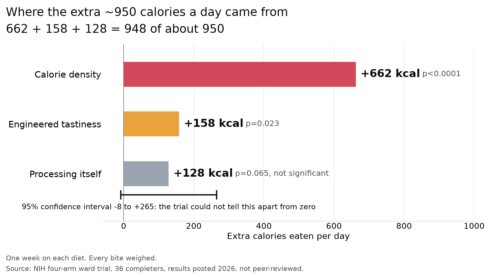
The trials move most of the effect onto density. They do not clear processing.
- The 2019 trial stacked density, palatability and processing: +508 kcal/day. The 2026 trial isolated density alone: +662, larger than that combined total.
- The processing-only estimate is +128 kcal/day, interval -8 to 265. A direct effect up to roughly +250 kcal/day still fits.
- Dropping processed meat and sugary drinks from the ultra-processed variable takes cardiovascular disease from 1.11 to 1.00.
- A 2024 EPIC analysis tied ultra-processed intake to accidental death, which diet has no plausible route to. Every estimate here sits on a confounding floor.
- Expert raters barely agree on which foods are ultra-processed: Fleiss kappa 0.32 (0.34 for 177 raters on 111 generic foods), conventionally “fair”.
Why the two ward trials disagree on the numbers
They agree in principle. The density-only number being larger than the stacked total is unexplained.
- Why the density-only number is bigger is unresolved. It needs diet compositions neither trial has published.
- The two smallest contrasts, palatability at +158 and processing at +128, sit within 30 kcal of each other. The significance line falls between them, but the two numbers are not distinguishable.
- The supporting meta-analysis covers 10 trials. The matched-density result rests on only 5 of those comparisons: SMD 0.02 (95% CI -0.51 to 0.55), in Robinson 2026, now published (Crit Rev Food Sci Nutr, PMID 42746678), certainty rated low. An interval that wide is not a demonstrated null.
- A 2025 UK trial (55 people) ran both arms at national dietary guidelines. It still found about twice the weight loss on the minimally processed arm: 2% of body weight against 1% over eight weeks. Its minimally processed arm was still 28% lower in energy density, so it does not separate processing from density either.
- Inferred. Energy density is something processing produces, not a separate variable. Adjusting for it and then reporting no effect from processing answers a different question, as the theories page sets out.
Texture is a real candidate lever and not yet a clean one
Two trials move intake with texture. The second one changed other things too.
- Lasschuijt 2023 (n=18, energy density equalised) moved eating rate by 85% and intake by 33% with texture alone.
- Forde 2026 ran two 14-day diets, eaten ad libitum (as much as wanted), both arms ultra-processed (n=41, crossover). It found 369 kcal/day lower intake (95% CI 221 to 517) on the slow-texture arm. Measured means were 2,301 kcal/day slow against 2,671 fast. Participants were healthy-weight young adults, body weight did not change, and the trial was funded by a public-private partnership.
- Its arms also differed in fat (22 vs 33% of energy) and protein (21 vs 16%). The claim that macronutrients did not explain it rests on a post-hoc model. In that model, fat content moves in lockstep with which diet, so the model cannot tell them apart.
The bread anomaly: ultra-processed foods are not uniformly anything
Some ultra-processed categories track lower risk, by amounts too large to believe.
- Ultra-processed breads and cereals are inversely associated with type 2 diabetes in EPIC, HR 0.65 per 10% of intake, and inversely with cardiovascular disease in US cohorts.
- In the same US cohorts (Chen 2023) the split is by bread type: refined breads go with higher diabetes risk, cereals and dark or whole-grain breads with lower.
- Ultra-processed breakfast foods are positively associated with all-cause mortality (HR 1.04, 1.02 to 1.07).
- Some inverse hazard ratios here are too large to be real protection: plant-based meat alternatives at 0.46, breads at 0.65 in EPIC. Artifact runs in both directions, which should make you distrust the positive estimates too.
Which categories carry the cohort signal
Processed meat and sugary drinks carry most of it, and diet quality absorbs part of the rest.
- Cardiovascular disease is 1.11 in three US cohorts (about 200,000 people). Cardiovascular death is about 1.50 in a 2024 umbrella review, a review of reviews. Different outcomes, so not one range.
- Removing processed meat and sugary drinks from the ultra-processed variable takes total cardiovascular disease from 1.11 to 1.00 in those three cohorts. Coronary disease alone goes to 1.06, not fully to null.
- In Fang 2024, ready-to-heat mixed dishes are null for mortality, 1.02 (0.99 to 1.05).
- Ready-to-eat meat, poultry and seafood products are the strongest subgroup, 1.13 (1.10 to 1.16). Fang 2024 followed 74,563 women and 39,501 men (about 114,000). Across its outcomes this subgroup ran 1.06 to 1.43.
- Dairy desserts sit in between at 1.07.
- Adjusting for overall diet quality shrinks the remaining associations (Fang 2024).
What the accidental-death test proves, and what it does not
It puts a floor under the confounding, without sizing it.
- A 2024 EPIC analysis used accidental death as a negative-control outcome and found ultra-processed intake positively associated with it, HR 1.12 (1.02 to 1.23) per 10% of intake. Diet has no plausible direct route to accidental death, so most of that association is confounding, measured rather than assumed.
- Alcohol is not the explanation. Beer and wine sat in the processed group rather than the ultra-processed one, and the models adjusted for alcohol intake.
- It does not say what fraction of the disease associations is confounded, since confounding structure varies by outcome.
- It does mean every hazard ratio in this field, including processed meat and sugary drinks, sits on a nonzero confounding floor.
How badly defined the ultra-processed label is
Raters agree on the bucket and disagree about the food.
- Among 159 expert raters classifying 120 marketed foods, agreement was Fleiss kappa 0.32 (0.34 for 177 raters on 111 generic foods), conventionally “fair”, a chance-corrected statistic rather than a percentage of agreements.
- Only 3 of the 120 foods were classified identically by every rater, while 90 of the 120 drew a 91% ultra-processed assignment rate. Raters converge on the ultra-processed bucket and disagree about everything else.
- The same dietary data yields 7.9% or 45.9% ultra-processed depending on which system you use.
Additives, seed oils and MSG: where the evidence is
 Source: EFSA 2011 and 2015 intake estimates, Shah 2017 (FDA) adult estimate, Chassaing 2022 trial dose.
Nothing on the usual avoid-list has good human evidence of harm at realistic doses. Empty is not the same as disproven.
- The animal studies run at 60 to 33,000 times human intake, depending on whose intake you pick.
- The human emulsifier trials are mixed, not null. The one trial big enough (emulsifier restriction in Crohn’s disease) is positive and unpublished.
- One substance has a human signal at a real dose, erythritol. Two are precautionary flags: potassium bromate and titanium dioxide.
- Seed oils have no harm signal. Higher linoleic acid goes with lower cardiovascular mortality across 30 pooled cohorts.
- MSG is a sodium-reduction tool, at 12% sodium against table salt’s 39%.
What the human emulsifier trials found
Gut shifts in a short trial, one positive result that is not published yet.
- One 11-day feeding trial in healthy volunteers (n=16, 7 on carboxymethylcellulose) found reduced microbial diversity and reduced short-chain fatty acids, the compounds gut bacteria make from fiber. It also found bacteria encroaching on the mucus layer in 2 of the 7.
- Eleven days is too short for inflammatory markers to move, so “shifts without inflammation” describes the study length as much as the additive.
- In Crohn’s disease, a four-week trial with 24 people found no difference and was far too small to detect the effect at issue.
- The one trial big enough to detect the effect (n=154, 49.4% vs 30.7% response, p=0.019) is positive, and is so far a conference abstract.
- The French NutriNet-Santé cohort of about 100,000 adults links several emulsifiers to heart disease, type 2 diabetes and cancer. That design sits on the same confounding floor as the rest of this literature.
The dose multiples, with the denominator printed
A multiple with no denominator cannot be checked. These multiples change a lot depending on whose intake you use. Below, “bw” means body weight.
| Additive | Effect dose (animal, or human trial where noted) | Human denominator | Multiple |
|---|---|---|---|
| BHA | 2% of diet, about 1,000 mg/kg bw/day | EFSA 2011 adult mean 0.03 to 0.12 mg/kg/day | about 8,000 to 33,000x |
| BHA | same | EFSA 2011 adult 95th percentile 0.08 to 1.12 mg/kg/day | about 900 to 12,500x |
| Polysorbate-80 | 1% in drinking water, about 1,500 to 2,000 mg/kg bw/day | EFSA 2015 toddler high consumer 24.5 mg/kg/day | about 60 to 80x |
| Polysorbate-80 | same water, dose estimated at 1,500 to 2,500 mg/kg bw/day | FDA upper-bound US adult intake, about 10 to 20 mg/kg/day (Shah 2017) | about 75 to 250x |
| Carboxymethylcellulose | human trial dose 15 g/day | EFSA 2018 toddler 95th percentile up to 506 mg/kg/day | about 0.4x (15 g/day is about 214 mg/kg/day at 70 kg). Against the FDA upper-bound adult estimate (Shah 2017, 20 to 40 mg/kg/day) it is 5 to 11x. |
- The carboxymethylcellulose row matters most. The 10 to 30x figure that circulates has no published denominator.
- Against the toddler high-consumer estimate the human trial dose nearly vanishes. “Wide safety margin” depends on which consumer you pick.
Erythritol: a platelet result from a small non-randomized study
The dose is reachable. The design is weak.
- Erythritol, 30 g, described by the authors as one can of an erythritol-sweetened drink or a pint of keto ice cream. The study was non-randomized with 10 people per arm, endpoint platelet aggregation in a lab assay. Conflicts are declared and a rebuttal published.
- The observational erythritol signal is most likely the body’s own production. Serum banked largely before the sweetener was in wide use still predicts death, an inference from timing rather than a measurement. That does not settle the platelet question.
Potassium bromate: animal tumours and no human data
Precautionary rather than evidence-rated, on an ingredient that is free to avoid.
- Potassium bromate causes kidney and thyroid tumours in rats and is genotoxic, meaning it damages DNA, in living animals, with no human data at all.
- California banned it under AB 418, effective 2027.
Titanium dioxide: one rat result that did not replicate
The lesion finding is single-study, and the EU ban rested on something else.
- Titanium dioxide. Precancerous colon lesions appeared at 10 mg/kg bw/day in rats, a dose the authors justified as a child’s exposure, against adult intake of 0.2 to 1 mg/kg bw/day.
- The low-dose arm was null, and a larger rat study did not replicate the finding.
- The EU’s 2022 ban rested on unresolved genotoxicity, not the lesions.
- A human crossover trial (31 adults, 2 mg/kg a day for two weeks) found a shift in which genes are switched on in gut tissue (a transcriptome enrichment), with null inflammation markers and no DNA-damage assay.
Seed oils: what the blood and trial data show
No inflammation signal, no mortality signal, and one confound that adjustment cannot remove.
- Thirty pooled cohorts (n=68,659) measured fatty acids in blood and tissue rather than asking people to recall meals. Higher linoleic acid, the main fat in seed oils, went with lower cardiovascular mortality.
- Johnson and Fritsche 2012 reviewed 15 trials and found “virtually no evidence” that dietary linoleic acid raises inflammatory markers in healthy adults.
- Su 2017 pooled 30 trials (n=1,377) and put the CRP effect at SMD 0.09 (95% CI -0.05 to 0.24), where CRP is C-reactive protein, a blood marker of inflammation.
- People with more linoleic acid in their blood also tend to eat less butter and meat, which adjustment cannot fully remove.
- The randomized mortality data are null rather than protective.
What the Cochrane 17% figure is about
Cutting saturated fat by any means, not seed oils specifically.
- The Cochrane figure people quote, 17% fewer cardiovascular events, is for reducing saturated fat by any means (12 trials, n=53,758).
- The polyunsaturated-replacement subgroup alone is 7 trials (n=3,895, RR 0.73).
- Replacing saturated fat with carbohydrate did no worse.
- The two trials that disagree are covered under Rule 4.
Red 3 was revoked under a rule that ignores dose
The law bars any animal carcinogen at any dose, whatever the mechanism.
- The FDA revoked the colour additive listing in January 2025, with food uses ending in 2027.
- The trigger was the Delaney Clause of the 1960 Color Additive Amendments. It bars any additive shown to cause cancer in animals at any dose.
- On the same page the FDA wrote that the male-rat mechanism “does not occur in humans.”
Where the MSG scare came from, and what it replaces
An injection study in newborn rodents, and a failed sensitivity trial.
- The “MSG makes you fat” claim traces to 1969 rodent work that injected the compound into newborn animals to damage part of the brain. That is not a dietary exposure.
- A multicentre double-blind trial covered about 100 to 130 self-identified sensitive people. Responses were inconsistent and did not reproduce. Reactions appeared only at large doses taken without food.
- MSG is about 12% sodium against table salt’s 39%.
- Partial substitution cut sodium by 31% to 61% across four tested recipes.
Organic food: what changes and what does not
Eating organic cuts the pesticide residues in your urine by about 90% within days. Nothing in the literature ties that change to a health outcome.
- Rempelos 2022 measured total pesticide excretion at 17 against 180 ug/day, a 91% drop, after two weeks.
- Organic crops carry 19% to 69% more polyphenols (phenolic acids to flavanones), 15% less protein and 8% less fiber (343 pooled publications).
- Pooling the three consumer cohorts gives 0.93 (0.78 to 1.12) for cancer, no difference.
- No randomized trial of an organic diet with a health endpoint has ever been run.
- High confidence that no effect is established. Low confidence that no effect exists.
What the residue trials measured
Two small randomized trials, both showing the same fast drop.
- Rempelos 2022, 27 people randomized to an organic or a conventional diet for two weeks: total pesticide excretion 17 against 180 ug/day, a 91% drop.
- Oates 2014, 13 adults, randomized crossover, 7 days per arm: total organophosphate metabolites down 89%.
What differs in the food
Small composition differences in both directions, and the authors doubt some of their own numbers.
- Barański 2014 pooled 343 publications on crops: polyphenols 19% to 69% higher (phenolic acids to flavanones), protein 15% lower, fiber 8% lower. The authors flag several of those estimates, protein, cadmium and total antioxidant activity among them, as less reliable.
- Średnicka-Tober 2016 pooled 196 publications on milk: total omega-3 56% higher, iodine 74% lower. The absolute omega-3 gain works out at roughly 60 to 90 mg a day per half litre, derived from the percentages rather than published.
Why the consumer cohorts disagree
One French cohort found a quarter less cancer. The two larger ones found nothing.
- Baudry 2018 followed 68,946 French adults for a mean 4.56 years: a quarter less cancer in the top organic quarter, 0.75 (0.63 to 0.88), and 0.76 (0.64 to 0.90) after also adjusting for dietary pattern.
- Bradbury 2014 followed 623,080 UK women for 9.3 years: 1.03 (0.99 to 1.07), no difference. Andersen 2023 followed 41,928 Danes for a median 15 years: no difference.
- Theodoridis 2025 pooled all three cohorts: 0.93 (0.78 to 1.12).
- The longest biomarker trial is 24 weeks.
The caveat that survives: cumulative organophosphates
A margin-of-safety argument about pregnancy and toddlers, not a finding.
- EFSA is only 50% to 90% certain that French children stay under its cumulative threshold.
- EPA’s chlorpyrifos estimate for children 1 to 2 is 9.7% of the child-specific dose limit from food alone.
- The neurodevelopmental effects measured in farm-community and inner-city cohorts appeared below the regulatory limits.
- Overturned by a cohort that measures pesticide biomarkers in urine in a general non-farm population, links them to a hard outcome, and attributes the exposure to food. Two studies already do the first two (Bouchard 2010 on ADHD, Bao 2020 on mortality) and neither can say where the exposure came from.
Validation (2026-09-09)
Checked against primary sources. Every figure traces to the working documents linked above, each carrying its study design, sample size and a source link. The organic-food figures were checked against the papers themselves (Barański 2014, Średnicka-Tober 2016, Rempelos 2022, Baudry 2018, Bradbury 2014, Andersen 2023, Theodoridis 2025, EFSA cumulative assessment). Derivations are labelled: the 4% to 4.7% colorectal move comes from the published 18% increase per 50 g/day, and the +4 to +14 point diabetes move applies the hazard-ratio range to a cumulative lifetime risk.
Not verified. Nothing was measured directly. Several load-bearing results are not yet peer reviewed: the 2026 ward-trial numbers are registry postings, and the emulsifier trial that was big enough is a conference abstract. In the working documents, citations recalled rather than fetched are flagged inline.
Verdict. Source-confirmed for the figures that carry a fetched primary source, unverified for the items listed above. Held unpublished until the registry results reach peer review.
Licensed CC BY 4.0. Corrections and counter-evidence welcome via /thanks/.